Visualization
The Visualization page helps you inspect completed results, predictions for open trials, and the fitted surrogate model. Open it from the experiment detail view under Visualization.
What you can analyze
Visualization combines completed trials with available predictions for Pending and Accepted trials. Some views depend on the experiment's objective and number of targets:
- Convergence is always available and shows how measured trial results compare with the cumulative best result over time.
- Desirability appears when the experiment uses a desirability objective. It shows how the overall desirability score changes across trials.
- Pareto front appears when the experiment has multiple targets and is not using desirability. It helps you compare trade-offs between competing outcomes.
- Parameter importance is always listed and explains the surrogate model output for a selected target. It includes a beeswarm plot for the direction and distribution of SHAP values and a bar chart for overall importance. It requires enough completed measurements to fit the model.
- Parallel coordinates is always listed and shows every completed trial as one line across all parameters and the selected targets. It helps you see which parameter settings lead to high or low target values.
How to use the page
Select targets or parameters
The left side of the page changes based on the active visualization:
- In Convergence and Pareto front, use the target list to choose which targets to display.
- In Parameter importance, select one target to explain its surrogate model output.
- In Parallel coordinates, choose which targets to add as axes. The view starts with one target selected.
- In Desirability, use the parameter sidebar to choose which parameter to inspect.
Use the right toolbar
For views with a series legend, the legend controls which plotted series are visible:
- In Convergence, you can compare the cumulative best line against individual measurements and predictions for open trials.
- In Desirability, the legend controls the desirability trend.
- In Pareto front, the legend distinguishes Pareto-optimal points from dominated points.
Click legend items to show or hide them. Double-click a legend item to focus on a single series.
In Parameter importance, the right toolbar displays a feature-value scale when the experiment has numeric parameters. Adjust its range to filter numeric points in the beeswarm plot.
In Parallel coordinates, the right toolbar shows Color and its color scale. Drag a target from the target list onto Color to color lines by that target. Adjust the color scale range to show only trials within that range of target values.
Reading the views
Convergence
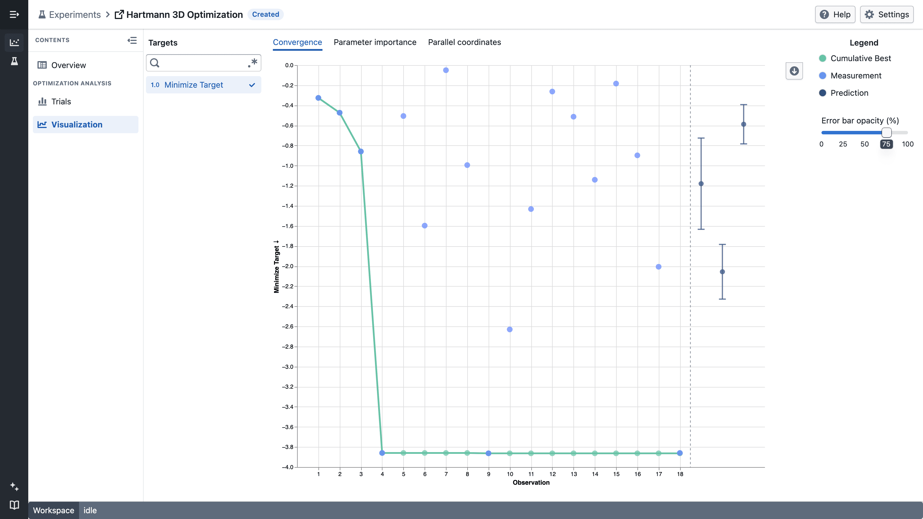
Use Convergence to answer:
- Are trial results improving over time?
- Has the experiment already found a strong region?
- Are recent measurements still moving the best-so-far result?
- What target values does BayBE predict for Pending and Accepted trials, and how uncertain are those predictions?
Predictions appear as points with error bars on the same target axis as completed measurements. The point is the posterior mean. The error bar extends from mean − std to mean + std, where std is the posterior standard deviation. These bounds describe model uncertainty; they are not observed minimum and maximum values or a confidence interval.
The x-axis numbers completed target results as observations in the order they were completed. Trials that do not produce a result for the selected target do not leave gaps. When multiple targets are selected, predictions begin after the largest observation count so every panel shares the same predicted section. The dashed vertical line separates completed observations from predictions. Hover over a measured point to see its original trial number and completion time.
Hover over a prediction to see its value and lower and upper bounds. Use Error bar opacity (%) in the right toolbar to make the error bars more or less prominent. Set it to 0% to hide the bars while keeping the prediction points visible.
Desirability
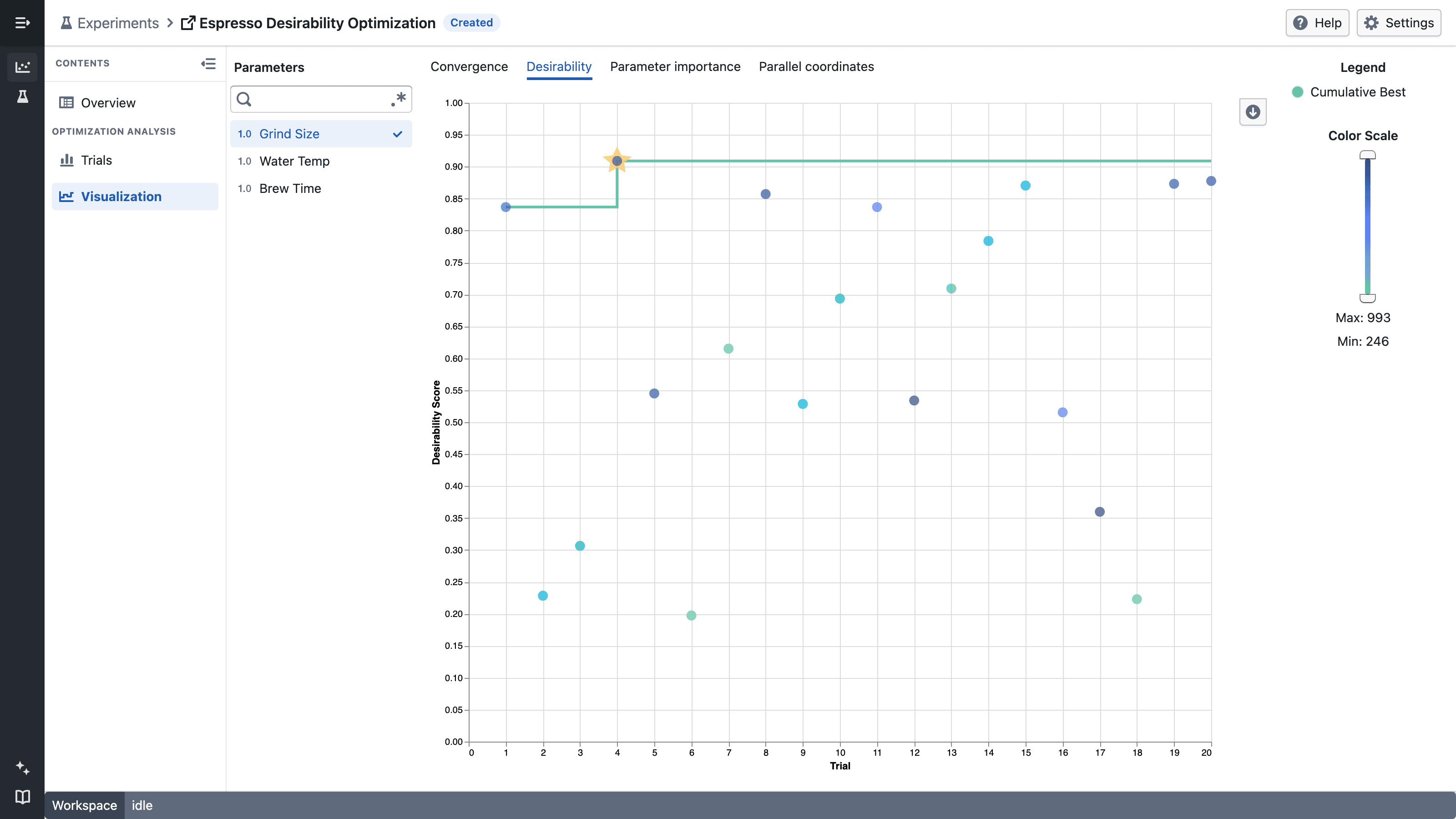
Use Desirability when multiple targets are combined into one overall objective. This is useful when you want one score that reflects how well a trial balances all targets together.
Pareto front
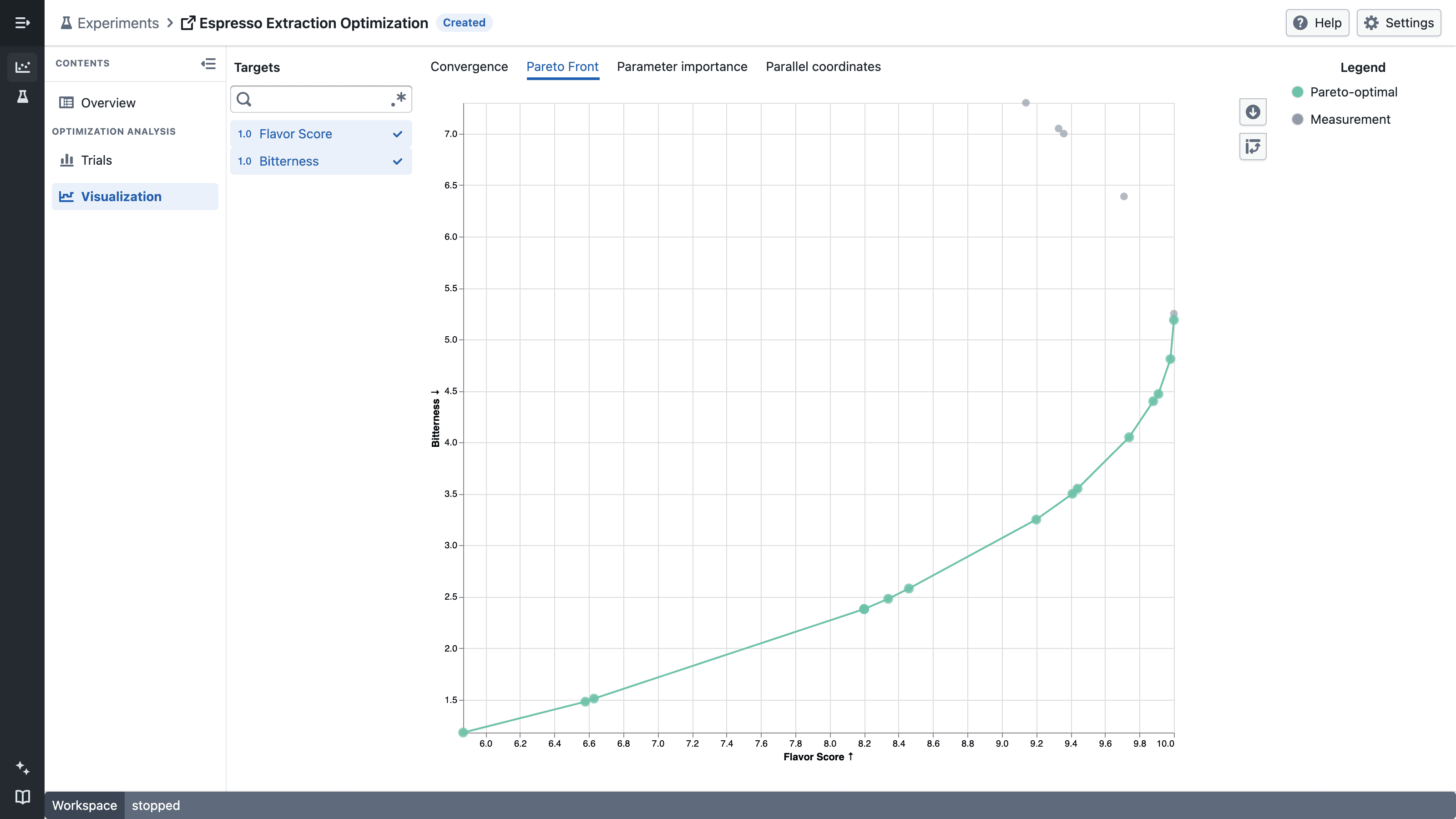
Use Pareto front when you want to compare trade-offs directly instead of collapsing them into one score. This is useful when improving one target tends to worsen another and you want to review the alternatives before deciding.
Each point represents a completed trial for the two selected targets. Pareto-optimal points form the highlighted front; the remaining measurements are dominated because another trial performs at least as well without worsening the other target. Use the target list to choose the two axes, and use the toolbar to swap them.
Parameter importance
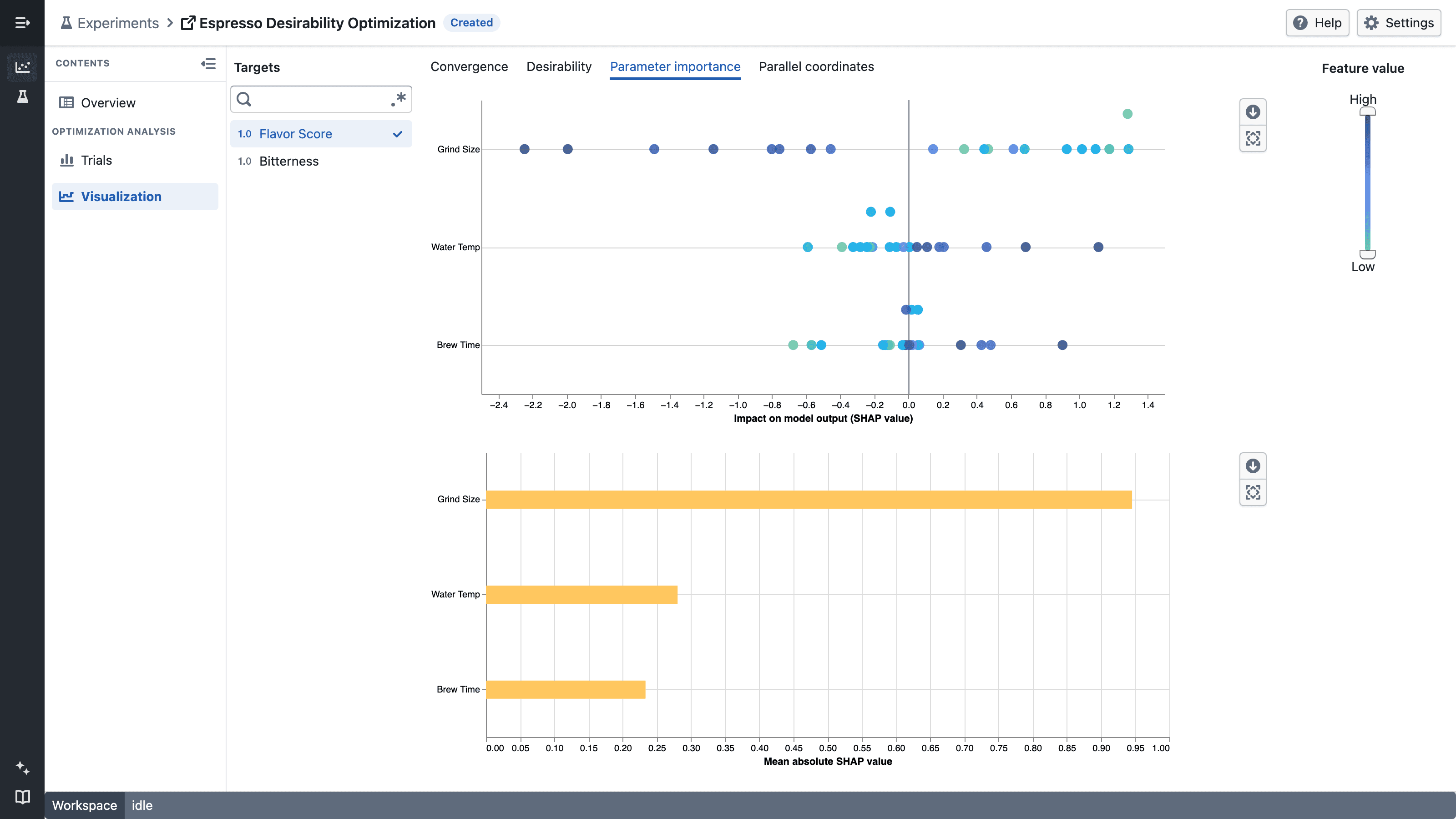
Select a target to explain its surrogate model output. Both charts order parameters by their mean absolute SHAP value, with the most important parameter first.
- The beeswarm plot shows one point per completed trial used to explain the model. Values farther from zero have a larger impact on the model output. Positive values increase the output relative to its baseline, while negative values decrease it.
- For each numeric parameter, point color represents its relative feature value from low to high. Categorical parameter values appear in gray.
- The bar chart shows the mean absolute SHAP value across the completed trials. Longer bars identify parameters with a larger average impact, regardless of direction.
Use the feature-value range control to focus the beeswarm plot on lower or higher numeric parameter values. The control does not filter categorical points or change the bar chart.
Parallel coordinates
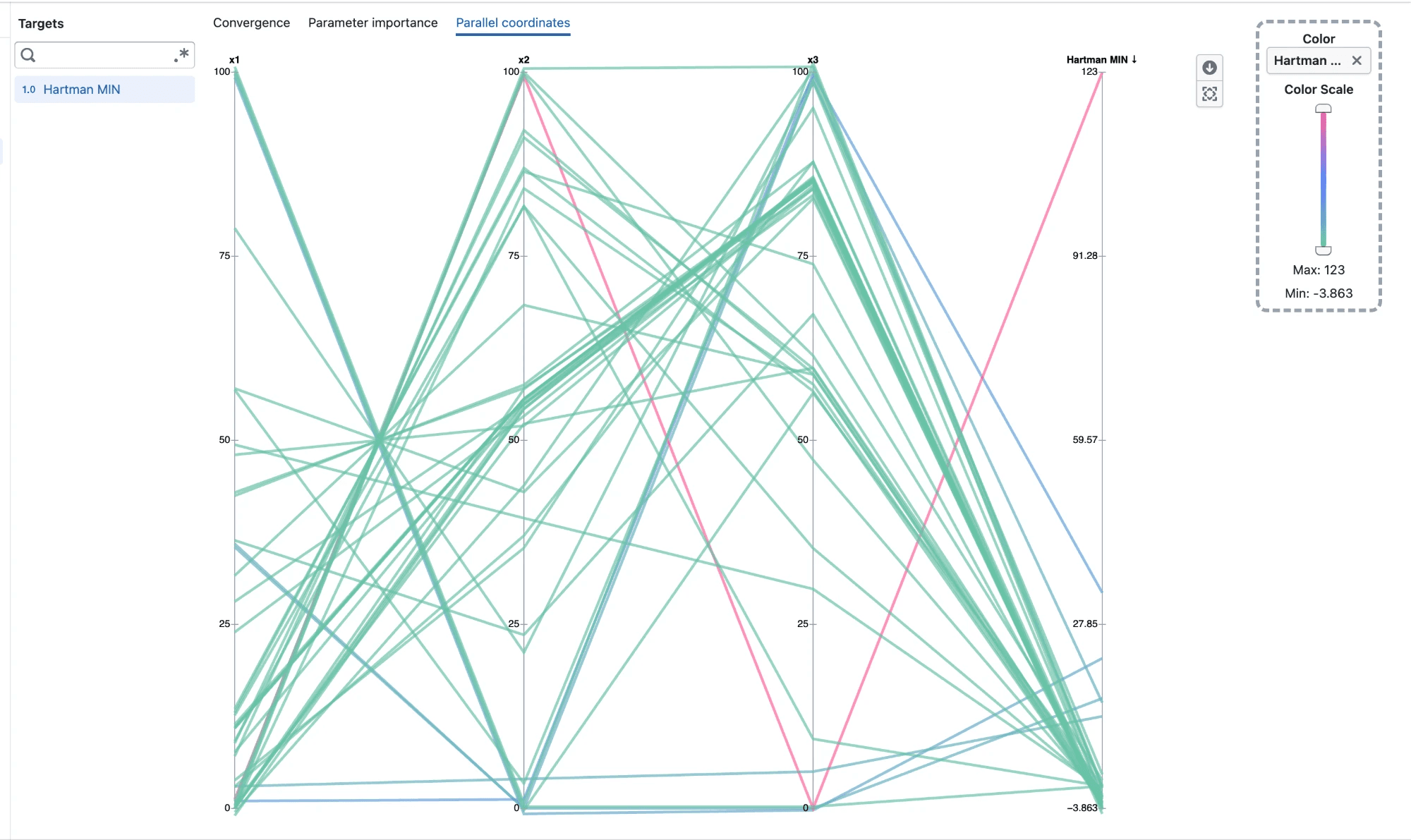
Use Parallel coordinates to answer:
- Which parameter settings do the best trials have in common?
- Are good results concentrated in one region of a parameter, or spread across its range?
- How do settings for one parameter relate to settings for another?
Each completed trial is drawn as one line. The line crosses every parameter axis, followed by an axis for each selected target. Every axis has its own scale, so parameters and targets with different units can be compared side by side. Numeric axes show their values as ticks, and categorical axes show one tick per category. Hover over a line to see the trial number and its value on every axis.
Lines are colored by the last selected target, so you can follow where trials end up. To color by a different target, drag it from the target list onto Color in the right toolbar. If that target is not selected yet, it is added to the chart. Clear Color to draw every line in a single color.
Drag an axis title left or right to change the order of the axes. For example, move a parameter next to a target to see how the two relate.
When several trials share the same value on an axis, their lines are spread slightly apart so each one stays visible. Trials with a unique value stay exactly on their tick.
Notes
- Visualization becomes more useful as more trials are completed.
- If no completed trials are available yet, the charts may be empty or have very limited information.
- Parameter importance explains the fitted model and does not establish that a parameter causes a target outcome.
- Parallel coordinates only shows completed trials that have a value on every axis. Axis order and the color choice reset when you leave the tab.
- Convergence, Parameter importance, and Parallel coordinates are always listed. Desirability appears only for a desirability objective, while Pareto front appears only for experiments with multiple targets that do not use a desirability objective.